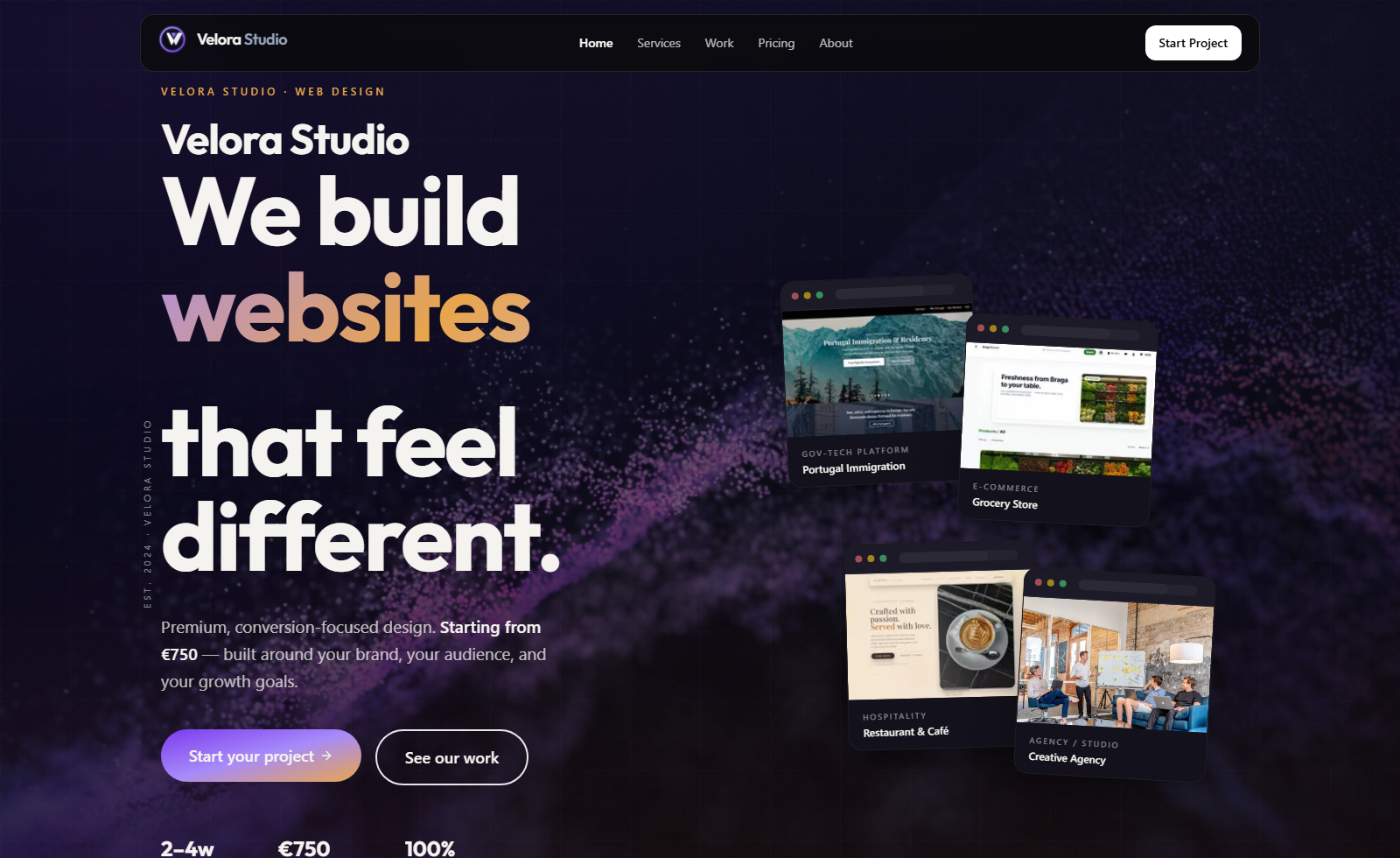
Responsive Front-End Development
Responsive front-end builds that stay polished across mobile, tablet, and desktop.
Overview
We develop websites so the design still feels intentional when real users open it on different screen sizes and devices. That includes responsive layouts, thoughtful spacing, readable typography, smooth interactions, and performance-aware implementation that avoids the usual drop-off in quality between concept and launch.
Key benefits
Consistent experience across mobile, tablet, laptop, and desktop
Cleaner implementation that protects the quality of the original design
Performance-aware front-end decisions that reduce friction during browsing
Launch-ready pages that feel polished instead of partially adapted
Discuss your requirements
Our team can help you scope and plan this service for your organization.